Twitter

Wednesday, August 14, 2013

Let's start from the beginning... a very good place to start.

School's back in session homies! Did you miss me? Now that our summer recess is officially over, it's time to get back to work. Whenever people come to me, the self proclaimed GURU of design (hey lay off me, I'm using The Secret here, cant you tell?), it never fails that I hear the same thing over and over again: "I wouldn't even know where to start!".

As I was sitting on the beach, sipping a margarita this summer, I got to thinking. By the way, "sitting on the beach, sipping a margarita is code for slaving away at my desk, losing countless hours of sleep and depriving myself of all young human social rights. Nonetheless, as we begin our journey into the crisp, earth tone adventure that is Autumn, I've decided to start this homeboy semester with a 5 step process to keep you from collapsing into the center of your living room, mid anxiety attack, holding design magazines and fabric swatches. It's very simple. So simple, in fact, that I've made it even more simple by drawing a nifty diagram. Drum roll please...

My back-to-school gift to you, homies: the 5 basic steps to launching a successful design!


In case you don't feel like reading the fine print, I'll break it down for you. It basically goes as follows:

1. Start with a concept. Research it.
2. Collect you thoughts. Use a mood board or scrapbook of some kind. Grab anything that pertains to you concept and stick it in your collection.
3. Address your staple pieces. These are pieces who's function is mandatory in the room, i.e. seating, shelving, storage. Also, the time has come to decide on a color palate. Just rip off the Band-Aid. It's not that bad.
4. Break out your wallet and update your big ticket items. I'm all about mixing old and new, but as a general rule of thumb if you cannot show some of your furniture to a person on the first date for fear of complete rejection, it's time to go.
5. Play Debbie Decorator. Now you get to go in and finish it off with those great clearance finds at Target, or that set of throw pillows you've been eyeing at Pottery Barn. These are the not-so-subtle interest points in your space, so utilize them! These items should also be changeable. Ya heard?

And what kind of teacher would I be if I didn't provide an example right? Here's a quick one:

Concept: I'm channeling my last trip to Vegas (or what I remember of it) and rolling my design dice! Take notes, you're going to be seeing a lot of these babies this year. Two random words: Rustic Urban. I can deal with this.

Ideas: Here's my mood board. This can be as big or small as you need it to be.

Staple Items: Bookcase, end tables, accent chair, paint
Big Ticket Items: Sofa, Coffee table, Mirrors
Décor: Lamps, Books, Draperies, Misc.

Finished Design:

Do you feel a little more comfortable now? Just remember: even if you don't have one design bone in your body, there are countless inspiration photos out there to get the juices flowing. Take it step by step, even if it takes 3 or 4 months. You can do this!

homeboy.

Thursday, June 20, 2013

What's so great about Gatsby?

If you're anything like me, you've been perseverating thoughts of glamour from the 1930's lately due to the latest incarnation of The Great Gatsby. That's right, I'm hooked and there are a few reasons for why: First of all, Baz Lurman. duh. Secondly, an epic tale of unrequited love (I'm very familiar with this concept). Last but not least, I've always had an obsession with the interior stylings and architectural details of the early art deco period.
 
Naturally, I had my tickets to see Leo- I mean the film, opening night in the theater. Before I go into my usual rant, let me take you on a little adventure and describe to you what it's like to see a movie with me. I come prepared: we're stopping at CVS before to stock up on high-calorie provisions and stuffing them into my "movie theater sweatshirt". After getting comfortable in our seats I like to talk about every preview that shows before the feature presentation stating whether or not I think it will be "really good" or "meh", you know because I'm a seasoned film critic with a very sophisticated cinematic palate (see my review of the classic south American feature Rio). Anyways, I usually spend my time picking out things that have nothing to do with the subject matter at hand. For example, in the latest Oz film, who wasn't thinking about Mila Kunis's floppy red hat the whole time? The night usually ends with me dissecting a film to a point I have n business going to, but it makes me feel good.
 
In the case of Gatsby, my design dreams were coming true before my very eyes. The decadent details of the Deco period were magnificently replicated and got me thinking: how would one tastefully compose a Deco inspired living space that doesn't come off as tacky or dated? To answer this question, I think you should know a little bit about what Deco actually is. Many people are confined to the South Beach style of Art Deco. It's not all pastels, though. Art Deco actually started in France during the 1920's and went through a few incarnations over the next 30 years or so. It started off as the ever-opulent styles we saw in Gatsby, and slowly morphed into the neon and chrome version that Miami is known for.
 
Now the question is, how can we get the Great Gatsby look in our own spaces, without making our loved ones think we've gone off the deep end? Lucky for you, I went shopping for vintage pieces online and found a collection, both old and new, that will give you a modern-Gatsby look. Items like the ones I'm showing you can absolutely be found at your local antique stores, estate sales or auctions.
 

Here are a few key elements to look for when trying to put a tasteful, Deco spin on things:
1.Geometry. No, I'm not talking about your favorite high school math class. Art Deco was all about geometry and repeating patterns, both hard and soft.

2. Animal prints. Personally, I never need an excuse to use prints, but I can understand your trepidation. Both prints and animals themselves were a huge part of Art Deco décor and design. leopard, giraffe and zebra are just a few of the options you have to choose from. Did you see that leopard chaise? Did you die? You did.

3. Heavy Metal. keeping your scheme within a metallic color story will have your space screaming with deco delight. Black, gold, silver and white have the starring roles here, with supporting players like blush pinks and dusty khakis. Also, don't be afraid to find pieces with chrome accents. think streamlined.

4. Girls Girls Girls. This period of design really embraced the female form. everything from lamps to artwork showcased the most luxurious ladies wearing your fantasy wardrobe. this is a really fin way to infuse some vintage flare in an unexpected way.
The day after my trip to the theater resulted in this sketch above, of a fantasy Gatsby-inspired living room. The 19' high ceiling may be a stretch, but who doesn't love a good work of fiction?
 
homeboy.

Wednesday, June 5, 2013

Mini Blog: So... I bought a sofa.

Apparently I was living in an alternate universe. Somewhere in the deep recesses of my brain I somehow justified the purchase of a stark white sofa. Don't get me wrong, the thought of a crisp, white sofa nestled amongst the trappings of a stylish, urban apartment is mouthwatering to me, as a designer. Then reality took her glove off and smacked me in the face. My love of dogs and wine quickly shattered the fragile, lacey dream of an ivory multi-seater. Sofas go through a lot: guests, spills, you know... college. Think about all of the questionable things your sofa has seen over the years, including an up close view of your ass, your mom's ass, that random guy's ass and whatever other ass has passed through your place.

I've come to the conclusion that I need to stop subjecting my seating to the atrocities of life as a twenty-something (and yes, I am still a twenty-something). I came to said conclusion while standing in front of my white sofa last week and having an inner battle as to whether or not I actually wanted to sit on it. You see, my white, [semi]virginal sofa has tolerated things like this:
 

An infinite amount of stains, whose origins are totally untraceable, now mark her from head to toe as well as a previous cushion dismemberment thanks to one of my beloved four legged children, white sofa's days were numbered, and I knew it.

So.... I bought a sofa. Meet Henry. Dove Grey, performance velvet, mid- century realness.


My 3 tips before making such a purpose:

1. Scale- Make sure it fits. You really want to make sure it's not too big, or too small. Oh, and make sure you can get it up the stairs and through the front door.

2. Function- Select an upholstery that will suit your lifestyle. Henry is a "performance velvet", which is a fancy term for polyester. make sure the upholstery you select will clean and wear well. you'll thank me later.

3. Maintenance- First thing I did after carrying Henry over the threshold? Scotch Guarded the shit out of him. Preventative measures, homies.

Homeboy.

Wednesday, May 22, 2013

Shaken, not stirred: Mix it up!

As we go down this design road, we're often faced with many crossroads, decisions and dilemmas that make us question our own personal aesthetics. So often, when consulting on a residential project I'm confronted with a client who is afraid to not follow "the rules". Granted, there are widely known interior design guidelines that make it really easy for even the most design-challenged individual to put together a room with some resemblance to style. It's kind of like using the FOIL method in high school algebra. By using a fool-proof method, like buying an entire prefab living room set or choosing colors that "go together", you too can play it safe. Well I' here to push you out of your comfort zone, whether you like it or not.

It's my humble opinion that the eclectic nature of life is the basis to a fantastic living space. We go through life collecting fantastic things that are just screaming to be used and admired. Funny story: My other half recently had a death in the family. Sad face. However, after collecting the belongings of said family member (sad face) a large chalk portrait of a young boy appeared on our wall. Amongst the many thought produced by the constant inner monologue inside my head, I thought that the young boy looked familiar, but paid no mind. I figured that the portrait was of some sentimental value, and even though it disturbed the carefully arranged, OCD level of décor in our apartment, I would let it stay. For now. Two weeks later it was revealed to me that it the portrait is actually of my other half. I cried (sad face) and now I'm obsessed with the portrait. Seriously, though. Once the emotional attachment was unearthed, the portrait became SO chic. like, kind of amazing.
Can you believe I was going to secretly put this in the closet in hopes he wouldn't notice? Don't judge me.
 Whether they be furniture pieces, dishware or even that old chair from Grandma's house that you shoved so ruthlessly into the storage unit, look at them with a new set of eyes even if they don't "go together". Keep your eye out at estate sales for vintage pieces to go along with you super modern bed, or classic light fixtures to go above your transitional dining table. I love mixing things that seem unexpected, so I decided to challenge myself for your amusement and also to show you that stepping outside of the box is both not scary and fruitful.

Challenge: A clusterf*ck of design Genres.
Contenders: Transitional, Louis XI, Vintage, Modern, Contemporary, Tribal, Abstract and Moorish.
It was with this menagerie I decided to sketch my design feelings into a harmonious, balanced little apartment to show you how these things, though you may not think so at first fit together seamlessly.
Pretty good right? By arranging each piece appropriately, things kind of just blend and mix, creating a very eclectic and tasteful mix. So the moral of the story is to not be afraid of things that don't quite "go together". Your space is a reflection of you, your life and the experiences you've had.
 
Now let's all hold hands.
 
Homeboy.


Wednesday, May 8, 2013

Bringing the Outdoors In: Whatever that means.


It turns out that those countless hours spent in a high school biology class weren’t a waste after all. Through the natural wonder that is chlorophyll and root systems, plant life has grown like weeds, right into our interior environments. How many times have you found yourself desperate for design advice, furiously flipping through design articles online and seen the cryptic mantra: “bring the outdoors in”? Well thanks HGTV online, but what in God’s name does that actually mean? Are you suggesting I replace my area rug with freshly laid sod squares? Or maybe take a shower with the hose? Let me clear something up for you, homies: bringing the outdoors in simply refers to referencing outdoor elements within your living space, specifically with plant life. Tip: Using plants is seriously the easiest way to breathe sophistication and life into your space. Whether it be the bedroom, bathroom or communal areas, a vase of fresh flowers instantly makes your interiors feel finished and more put together.
Inserting plant life into your interior scheme has its benefits. Not only is it aesthetically pleasing, adding texture and color, but plant life increases the indoor air quality of a space too. It’s a win-win situation right? There are plenty of options when it comes to fusing in your foliage, so buckle up it’s going to be a wild ride… if you’re an old lady.
The fastest, easiest way to liven up your place is to simply run to the corner flower market, or even Trader Joe’s really, grand some fresh flowers and stuff them in a vase. So you’re not endowed with a green thumb. Neither am I. best part about the whole flowers-in-vase idea: you just have to add water. OK and maybe that packet of poison that comes with them. Having fresh flowers set out instantly makes it seem like you have it all together. No matter if your place is a mismatched crack house (that’s my terminology for anything I, homeboy., have not personally touched with my little design fingers) for some reason when flowers are on the counter, everything seems like it’s supposed to be that way. It makes people think “well if they have flowers out, they must really know their sh*t, and they probably feel really comfortable here”. Isn’t that amazing? This little theory of mine explains the endless amount of fresh flowers during my college years.
Blooming flowers aren’t the only option, however. Try thinking vertically. With so much focus these days on the sustainable movement and green design, a new application for plant life has been born and can make a killer impact in your place. Introducing: Living walls. By planting small, leafy green plants in a vertical fashion, living walls or plant walls are giving your Grandma’s wallpaper a run for its money. In a recent restaurant project, I even applied herbs vertically, to much success. Get creative! So how do you go about hanging plants vertically? So simple y’all. There are many manufacturers who actually sell living wall systems that you can purchase and install yourself. This is such a cool and modern way to add interest to your place, and really green of you, too.
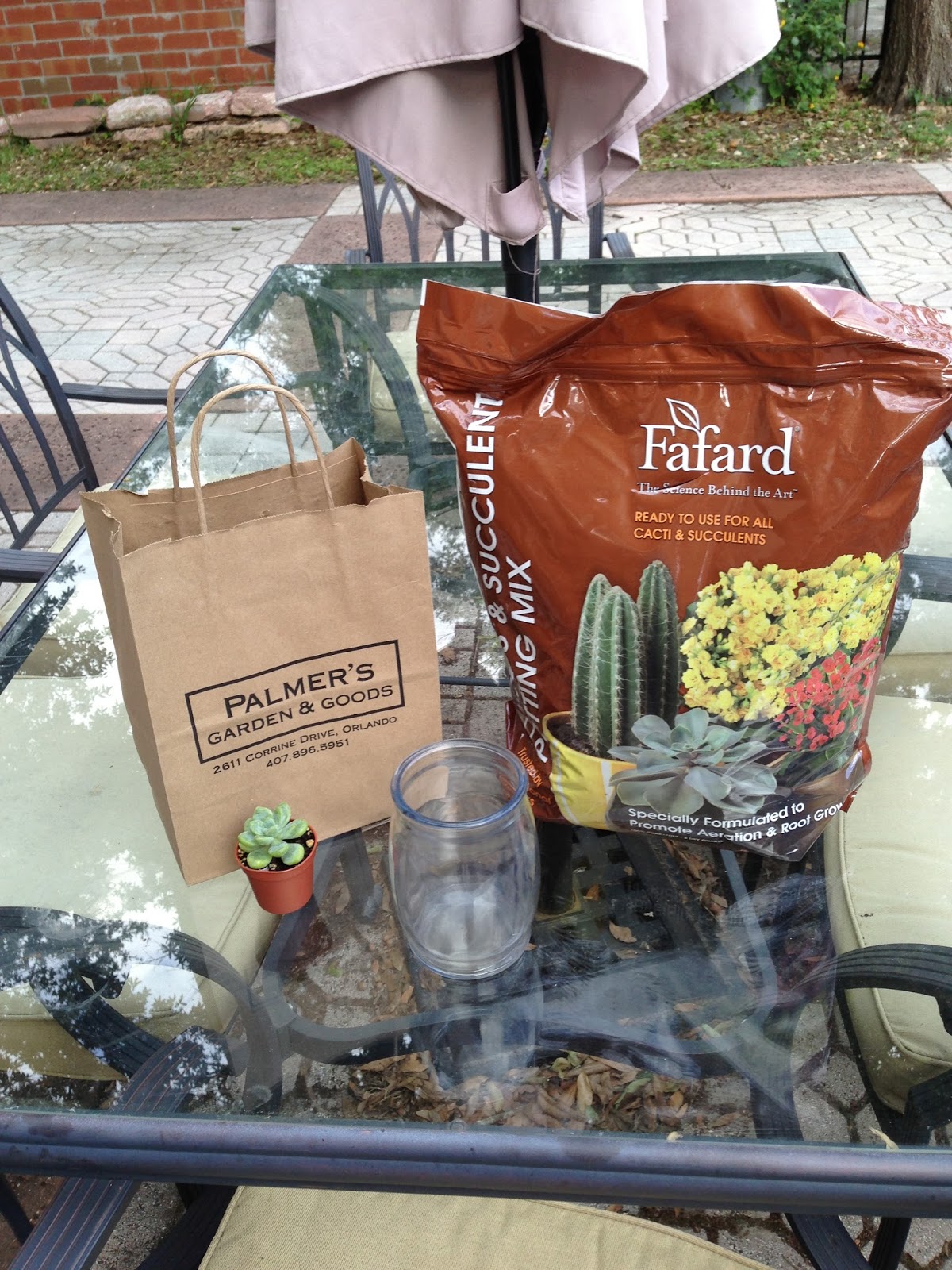
My favorite trend when it comes to interior plants is terrariums. These glass encasements are so chic, while maintaining a natural touch. Terrariums are great for showcasing low-maintenance succulents and air plants, which are so easy to take care of. Between you and me, I love the look of succulents, which are a member of the cacti family. I kind of love their architectural shapes, and also the fact that they remind me of my childhood obsession: Audrey II from Little Shop of Horrors. Since I can’t have an Audrey II of my own (can you imagine trying to feed that thing?) the strangely beautiful succulents will have to do. So to put my publicly humiliating DIY skills to the test, I have created this terrarium out of an old candle jar, rocks, moss, soil and of course a few succulents.
 
After cleaning out the wax from the jar, I simply built the layers upon one another. It really doesn’t matter the order as long as the rocks stay on the bottom for draining purposes. My thumb is turning green as we speak. I should probably get that checked out.
There are some no-nos when it comes to using plants as décor, however. Nothing rubs me the wrong way quite like fake plants. That’s right, I said it. Fake plants are not acceptable at any point. FYI, when smoking in your car with the windows became passé, so did decorating with fake plants. First of all, they look fake. I hate to burst your bubble, but if you think you’re going to make us believe that lush, green ivy can survive for years on end above the bulkhead in your kitchen, you’ve got another thing coming. Also, they gather dust. My inner nerd and allergy sufferer is trying to tell you that all that collected dust can actually affect your comfort level.
Another foliage faux-pas that worries me is when I see dead (or “dried” as hoarders call them) flowers hanging upside down in a home. Though I appreciate you trying to channel your inner Moriticia Adams, hanging dead plants on the wall gives me the heebie jeebies. It’s sort of morbid, really dated and overall bad feng shui. According to the ancient Chinese art of placement, you always want life in your interior space. Not, um… death. Oh and avoid bonsai trees. you can store them with your old bong and lava lamp from college. Nice Try though.
Now go, be one with nature, homies. But take off your shoes before you walk on the carpet.

Wednesday, May 1, 2013

Mini Blog: 5 things I own that you should own.

So many people ask me what my own home looks like. When people hear the title "interior designer", they assume I live in Martha Stewart's guest house. Not to burst your bubbles, but that's not necessarily the case. Dont get me wrong, I'm not living in Buffalo Bill's murder hole from Silence of the Lambs, but my place probably isn't too different from yours.

This week we're keeping it short and sweet. I'm going to share 5 things I actually own that I love, love, love in my home. Feel free to grab these little gems yourselves and add to your own space. Oh, and dont forget the homeboy shrine in the corner.

1.
The Nate Berkus Collection from Target is like, the best thing to hit affordable home decor in a long time. Stylish, tailored accessories float effortlessly between masculine and feminine. I seriously have 10+ pieces from this collection in my house.

2.
The overlapping squares headboard from West Elm. I have had this headboard and bedframe for 5 years and still get compliments on it. OK that sounded bad. Compliments from houseguests. Aesthetically light, but still geometric and interesting. With a headboard like this, you instantly have a feature in your bedroom, so you can put the stripper pole in the storage unit now.

3.
This Bansas area rug from IKEA gives a plush wool look for not a lot of dough. It's varying grey color scheme is also great if you have pets or keep it in a high traffic area because it hides more. Also, the pilling isn't bad at all compared to most rugs.
 
4.
 

Last winter, Target and Neiman Marcus teamed up to produce a capsule collection featuring a number of famous designers and some "affordable"  pieces of home decor and fashion. This tumbler set from designer Altuzarra has become one of my most prized posessions! so chic and kind of 80's. It's a good idea to keep your eye out for capsule collections like these as more and more retailers are trying their hand at this.

5.


Last but not least, the Serena lamp from Pier 1 Imports. Simple and elegant, this table lamp plays on the concept of geometry and negative space. What i love about this piece is that you can totally change the lampshade whenever and it becomes a completely different lamp.

These items are in your right at your fingertips and affordable too! Tell the homeboy sent you.


Wednesday, April 24, 2013

Special Delivery: A chic, tasteful baby! (Part 2)

It's not everyday you get to pick the brain of an interior designer, and get truly inspired design solutions from a professional in the industry. Well, not for free anyways. And since you all probably need a break from my ramblings and how my brain relates the twisted adventures of my dating life to interior design, I figured I would enlist the help of New York interior designer Lindsay Macrae to walk us through part two of this "Special Delivery" edition of homeboy.
 
                                                              Lindsay Macrae (www.lindsaymacraeinteriordesign.com),

Lindsay seen here, being fabulous.
a veteran designer with experience in both high-end residential design as well as commercial applications has worked for some of the most renowned design firms in the country, including Marc Michaels Interior Design and Gensler. I was lucky enough to snag a walk through of a recent nurseryproject she completed, to give you a professional perspective of how a soon-to-be bedroom comes to life. This particular project, located in a shoebox-sized nursery in Manhattan, is a perfect prototype for space saving solutions as well as overall scheme inspiration. Tres Chic!


What is the name, location and s/f of the project? A nursery for Bailey, New York City, 105 SF
 

What types of wants and needs, if any, did the clients have pertaining to this particular room?  Bailey was my clients’ first born so they did not know what they needed for their nursery.  I had no clue myself.  I did some nursery research online and interviewed several new mothers to get an idea of what we needed.  My clients were my dream clients.  They did not have any preconceived ideas for the overall design scheme.  They only told me that their daughter was going to be very sophisticated and they wanted the room to be calm.  I used that info to develop a couple of design schemes for them to choose from. 


Where do you normally take your inspiration from when you approach a design project, and where did it come from for this one?  My inspiration depends on the type of project.  For a retail project, for example, I may be inspired by the location of the store or the merchandise itself.  For a workplace project, my inspiration might be the heritage of the company.  For this nursery project, we wanted to create a calm and elegant space.  I was inspired by the softness of clouds and the muted blues and lavenders of an evening sky. (<-- Love that)

What considerations did you specifically have to focus on for this project (Colors? Storage? Etc)  This project was in a true Manhattan apartment so space and storage was a big concern.  I needed to make sure that I didn’t fill the room with anything that wasn’t functional.  I searched high and low to find a glider that wasn’t oversized.  This room did not have a closet so I used a towel bar mounted on the underside of a wall shelf to create a clothing rod.

 
What was your overall goal for the project? My main goal was to have a happy client and relieve some of the stress associated with preparing for a new baby.  As an Etsy shop owner, I also wanted to support fellow shop owners by furnishing as much of the nursery as possible with items from Etsy.com.

 If you could colonize and design any of the planets in our solar system, which one would it be? What would be the design concept be? Venus – because it’s warmer there!  I would juxtapose futuristic furniture with old paintings of the Greek goddess, Venus. (<-- Obvi.)


Were there any challenges to this project?  The room was small, there was no closet, and there was a large free-standing air conditioning unit in the corner.  The A/C unit had to stay so I had to find a way to disguise it without blocking the flow of air.  I ended up using a folding screen/room divider which added to the charm of the room.  Also, My client’s due date got pushed up by 3 weeks so time was a concern.  I was in a mad rush at the end to get everything installed by the time my client returned home from the hospital. 

What tips do you have, as a professional, when it comes to clients who would like to design their own spaces like this one?  Don’t limit yourselves to standard children’s furniture and furnishings.  Think outside of the box.  Turn to local flea markets, antiques stores, and sites like etsy.com for one-of-a-kind furnishings.  If you’re on a budget, check ebay.com and craigslist.com first for nursery items – there’s a lot out there. (So true! Design is accessible, people!) Don’t limit yourself to a blue scheme for a boy or a pink scheme for a girl.  This is your baby’s first impression on the world.  Don’t be afraid to make a sophisticated, artsy, or wacky room.  Chose whatever colors and inspiration you like and have fun with your project!  (I love her.)
 

  What is your favorite color, pattern or feature you like to try and implement into a space to give it your signature?  A Louis Ghost Chair (by Philppe Starck for Kartell).  It’s the perfect mix of historical style and modern materials. (Fab.)  For this project I got to use a child-sized Louis Ghost Chair. (Baby fab.)

 What is your favorite candy? Chewy Nerds.  Hands down. (Bet you didn't see that one coming.)
 
By using cool greys, whites and touches of antique shimmer, Lindsay has concieved a really sophisticated baby room, hands down. This is also a great example of how you may think that your space doesnt have the square footage you need to properly execute a design this flawless, but it's all about proper planning. Good luck on your new adventures future mommies and daddies, and make sure to check out Lindsay Macrae's website at www.lindsaymacraeinteriordesign.com for a more detailed glimpse into her portfolio!

homeboy.